Turning Data Into A Story
Sometimes a graph says more than a thousand words. Other times, it needs a little help.
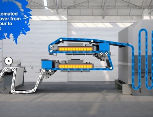
When Lloyd’s List wanted to present its annual results in a way that was clear, engaging and easy to follow, they turned to animation. Rather than relying on static charts and lengthy reports, we created a 2D motion graphics video that transformed complex information into a story people could actually enjoy watching.
The Challenge
Annual results are packed with valuable information, but they don’t always make for exciting viewing.
The challenge was taking detailed figures, industry data and business performance and presenting them in a way that kept viewers interested from beginning to end. The animation needed to feel professional while remaining simple enough for audiences to absorb the key messages quickly.
The Solution
Working closely with the Lloyd’s List team, we developed a clean, modern animation style that combined motion graphics, typography and carefully designed visuals to guide viewers through the results.
Every scene was designed to support the story rather than overwhelm it, helping audiences understand the key messages without distracting from the information itself. The finished animation delivered a polished narrative that was equally at home on a website, in presentations and across social media.
The Results
The completed animation gave Lloyd’s List a flexible communications tool that transformed a detailed annual report into an engaging visual presentation. It allowed important business information to be shared in a format that was easier to understand, more enjoyable to watch and far more likely to hold an audience’s attention.
What the Client Said
“WaveFX transformed a complex report into an engaging animation that communicated our key messages clearly and professionally. The finished film has become a valuable asset for presentations, our website and online communications.” Communications Manager, Lloyd’s List
From the Crew
2D Animation is often at its best when nobody notices it. If viewers are following the story rather than thinking about the graphics, we’ve done our job. Projects like this are a great reminder that good design isn’t about adding more, it’s about making complex information feel effortless to understand.
Our 3D and 2D Animation Advice
If you’re presenting results, statistics or technical information, don’t just ask how it looks, ask how easily people will understand it. A well designed animation can explain in two minutes what might otherwise take pages of text, making it far more likely your audience will stay engaged and remember the important points.
Planning Something Similar?
Whether you’re launching a product, presenting annual results or explaining a complex process, we’d love to help. From simple motion graphics to fully animated explainer videos, we’ll help you turn information into something people genuinely want to watch.



Leave A Comment